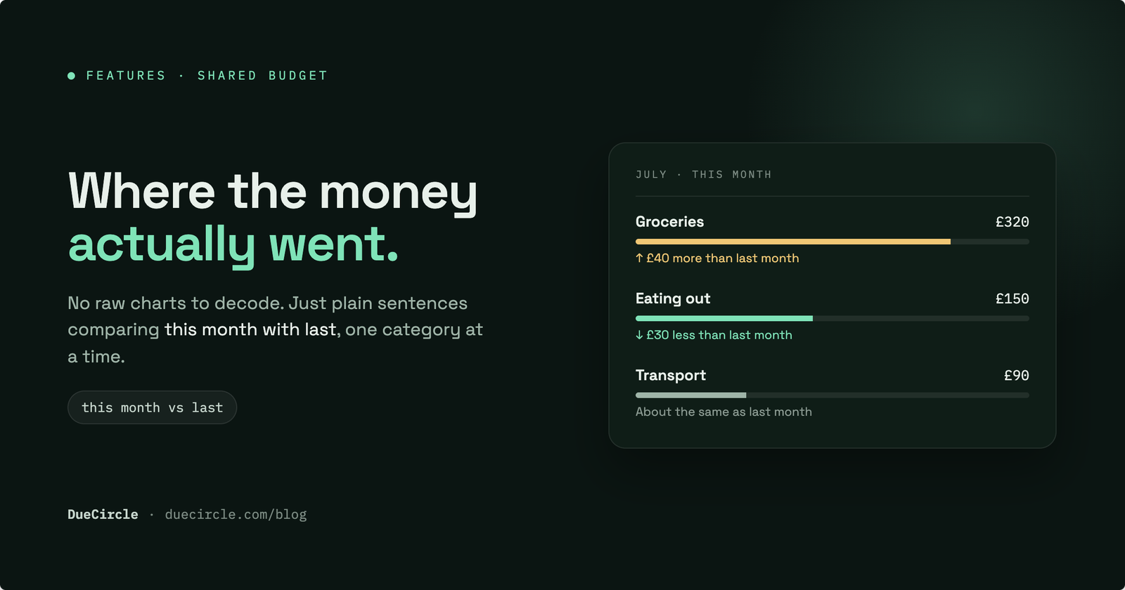
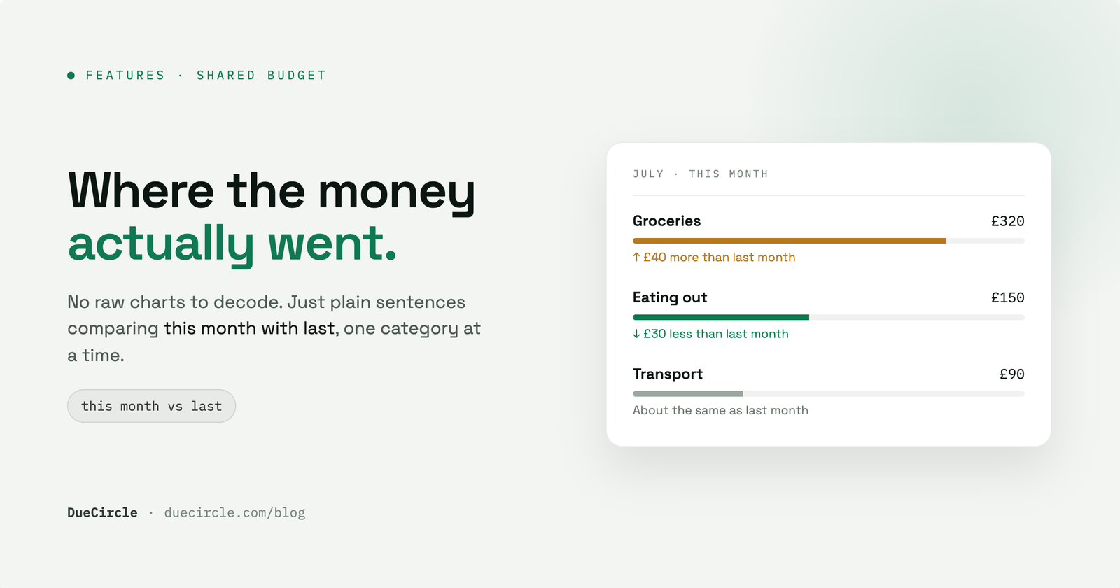
Most budgeting tools end the month by showing you a chart. Two bars, or a ring split into wedges, and the quiet expectation that you will study it and work out what changed. You are handed the raw data and left to become the analyst.
A shared budget is harder still, because the spending is spread across several people. Someone bought the groceries, someone else covered the electricity, a third person paid for the weekend away. By the time it lands in one place, nobody has the full picture in their head. What you actually want is not a chart. It is a sentence: what went up, by how much, and whether that should worry you.
Why raw charts don't help
A chart is a faithful record of what happened. It is not an explanation. When you open a dashboard and see groceries at one height in June and a slightly taller bar in July, the chart has done its job and then stopped. The work of noticing the difference, estimating its size, and deciding whether it matters is left entirely to you.
This is fine once a quarter when you have the patience for it. It is useless in the ten seconds you actually have, standing in the kitchen, wondering why the month felt tight. Colour and shape are a poor medium for a question that is really about number and direction.
The problem compounds in a household budget tracker, where the categories multiply. Groceries, utilities, transport, eating out, subscriptions, the occasional large one-off. Twelve small bars, each a little different from last month, is not insight. It is homework.
Compare this month with last, per category
The more useful unit is the comparison, made for you, one category at a time. Instead of two bars to interpret, a single line: groceries are ₹2,100, or 18 per cent, higher than last month. You read it once and you are done. The direction, the amount and the proportion are all in the sentence.
Doing this per category matters, because the total hides everything. A month can land almost exactly on last month's total while transport halved and eating out doubled. The headline says nothing changed. The categories say a great deal changed, and quietly cancelled out.
There is one honest edge to handle. When a category had no spend last month, a percentage is meaningless: you cannot be a hundred or a thousand per cent up from zero. In that case the comparison shows the actual amount and drops the percentage, rather than printing a number that looks precise and means nothing.
Over budget is not the same as up on last month
These two facts feel similar and are often shown as one. They are not the same, and they call for different reactions.
Spending more than last month is a change. Sometimes it is nothing: you bought a quarter's worth of a household staple in one shop, or a birthday fell this month. The right response is often to note it and move on. Being over budget is a breach of a limit you set on purpose. That is the one that should prompt a second look, whether or not the month before was higher or lower.
A category can be up on last month and still comfortably inside budget. A category can be down on last month and still over budget, because last month was worse. Collapsing the two into a single red arrow tells you something changed without telling you whether to care. Keeping them separate lets you glance, judge, and act, rather than investigate every wobble.
A worked example
Take a household of four sharing costs through one group. In June the utilities category ran to ₹4,000. The budget for it is ₹5,000, so June sat comfortably inside the limit and nobody thought about it.
In July the same category comes to ₹4,400. A chart would show two bars of almost the same height, and you would move on. The plain-language summary says something more precise: utilities are ₹400, or 10 per cent, higher than last month, and still within the ₹5,000 budget. Nothing to fix, but now you have seen it.
August reads ₹4,850. Still under budget, so a strict over-budget alert stays silent. But the comparison keeps speaking: up ₹450, or roughly 10 per cent, on July. That is the second consecutive rise, and this is the point of the whole exercise. A bill creeping up ten per cent a month is invisible in isolation and obvious in sequence. You have caught it in month two, with a small conversation about the heating, instead of in month six when it has quietly become the largest line in the household.
Catching the slow rise early
The bills that hurt are rarely the dramatic ones. A single large purchase announces itself. The damage tends to come from something that grows a little each month, small enough to ignore every single time, until six of those small increases have stacked into a number you cannot explain.
Monthly spending comparison exists mainly to catch this. Each month it restates the direction in words, so a rise that would be lost inside a bar's rounding shows up as a plain figure. Two of them in a row is a pattern you can see, name and question while it is still small.
This is where expense insights earn their place over a dashboard. A dashboard shows you a state. A short comparison shows you a trend, and a trend is the thing you can still do something about.
Setting a category budget, and why words beat dashboards
Category budgeting is the anchor that makes over-budget meaningful. You set a limit for a household or a trip, per category, once. Groceries ₹8,000, utilities ₹5,000, eating out ₹3,000. From then on the app has a line to measure against, which is what separates a real breach from a mere increase.
For a trip the same idea works over days rather than months. A limit on food, a limit on travel, and a running plain-language read on where each stands, so the group knows before the last day whether there is room for one more dinner out.
Words win over dashboards for one reason: a sentence carries a judgement a chart cannot. It states the amount, the direction and whether a limit was crossed, in the order you would ask about them. Everything in DueCircle is tracked to the exact integer, split across the group, and never pulled from a bank connection, so the numbers behind each sentence are ones you entered and can trust. The chart is still there if you want it. Most months, the sentence is all you need.
- Set a per-category limit for the household or trip, once
- Read one sentence per category: amount, direction, and whether the budget held
- Watch for two rises in a row, the early sign of a creeping bill
- Treat a breach and an increase as the different problems they are
Published 4 July 2026.